
Download the full report:
Something unusual is happening at the register. Economic caution is up, but spending on fashion and beauty hasn’t collapsed. It has been reorganized. Consumers aren’t buying less so much as buying differently, running every purchase through what amounts to an emotional audit: What does this do for me?
The Q4 2026 Studio Trends study calls the underlying mood dysoptimism, the experience of holding anxiety and hope simultaneously. It’s an uncomfortable state, and it has made people remarkably clear-eyed about what they want from the things they buy.
of Gen Z
and
of Millennials
now describe themselves as emotional spenders.
That isn’t impulsiveness. It’s a conscious expectation of an emotional return on investment. For brands, the implication is immediate. Functional benefit is table stakes. Emotional payoff is the differentiator. The fastest signal of which payoff a brand offers is color.
The Trend: Four Emotional Jobs, Four Color Languages
The study identifies four distinct emotional jobs consumers are hiring products to perform. The framework is useful because each job has its own color signature, acting as the connective tissue between consumer intent and product expression.
Emotional wellbeing
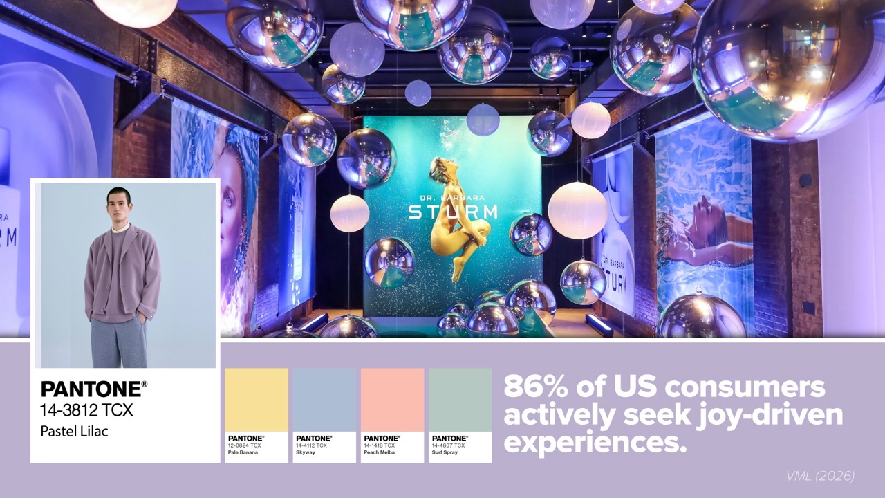
Emotional wellbeing positions fashion and beauty as the cheaper, closer route to comfort. Skincare and soft tailoring have quietly been reclassified from indulgence to emotional maintenance, with 86% of US consumers actively seeking joy-driven experiences.
These are colors engineered for nervous-system calm rather than attention.
Expressive individuality
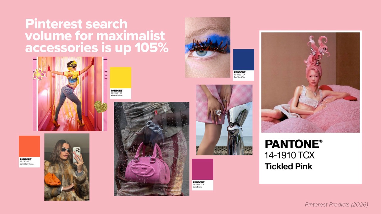
Expressive individuality runs in the opposite direction, and it marks the end of quiet luxury’s dominance. Pinterest search volume for maximalist accessories is up 105%, eccentric make-up 100%, and ’80s luxury a striking 225%.
Crucially, these shades read as enduring rather than seasonal, which is precisely the point.
Grounded security
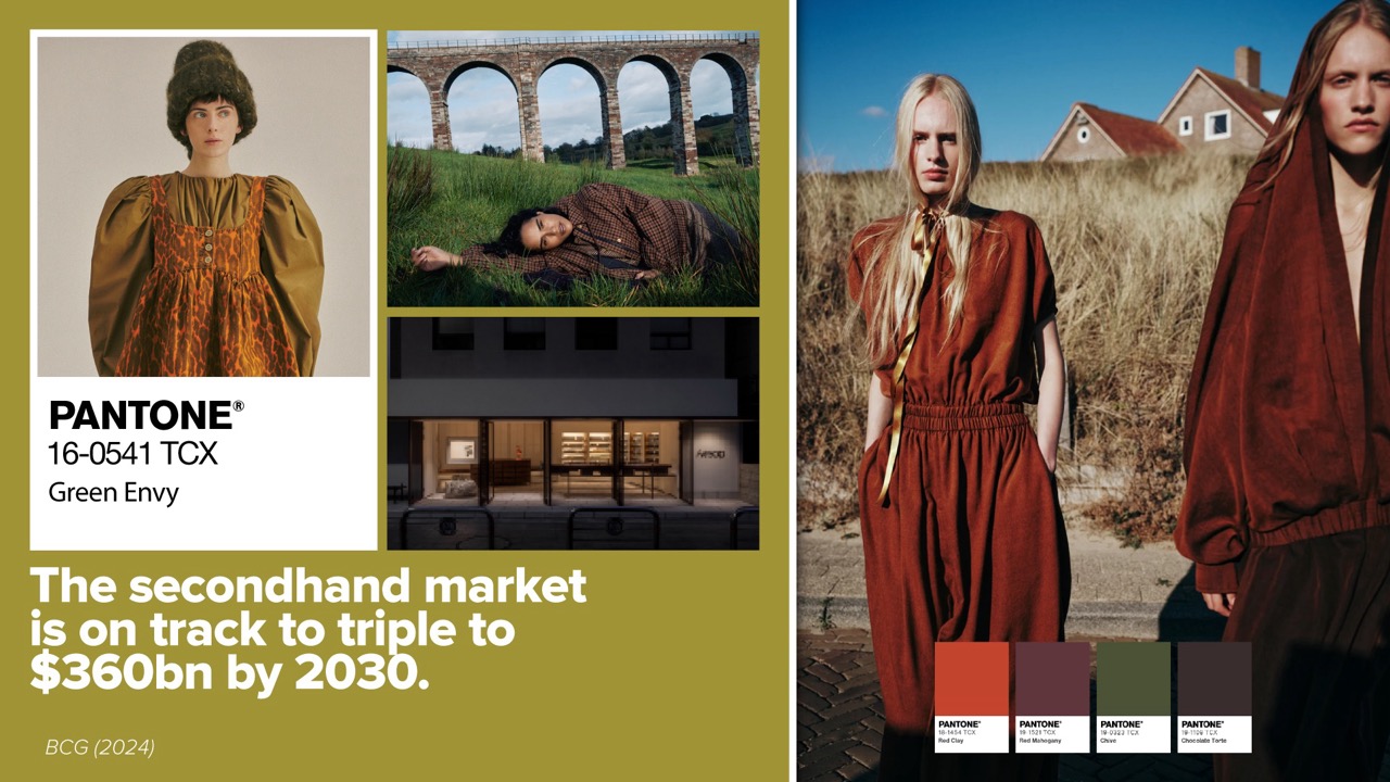
Grounded security answers uncertainty with permanence. Older cohorts in particular rank durability and ingredient integrity above mood or status, and the secondhand market is on track to triple to $360bn by 2030.
Crucially, these shades read as enduring rather than seasonal, which is precisely the point.
Identity and belonging
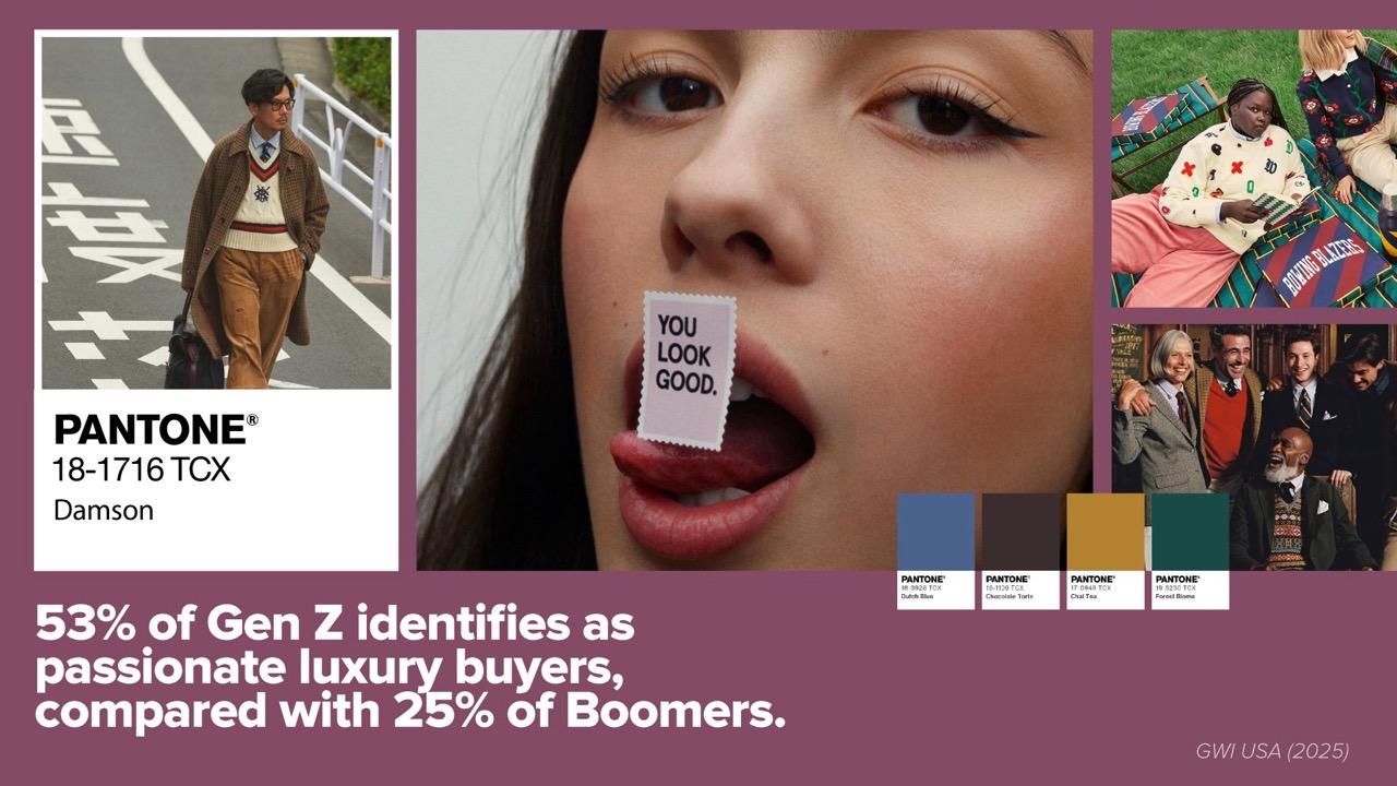
Identity and belonging turns purchase into membership. With 53% of Gen Z identifying as passionate luxury buyers against 25% of Boomers, heritage codes are being revived as inclusion signals.
These are shared codes, recognizable to the people meant to recognize them.
Strategic Implications
The temptation is to treat these four territories as audience segments. That would be a mistake. The same consumer shifts among all four based on the week, stressor, or occasion—buying Peaceful Lilac loungewear Sunday and Pop Pink eyeliner Thursday. Segmentation is situational, not demographic.
This changes how assortment, merchandising, and messaging should work. Brands locked into one emotional register risk serving customers only part of the time. A stronger approach creates a portfolio of distinct, visually coherent, instantly recognizable emotional lanes.
Color makes lanes legible but is often underused strategically. Palettes are usually chosen as decoration after positioning. This study reversed that order, matching successful case studies to their color signatures. The correlation holds: high-performing brands use palettes that clearly convey their emotional role.
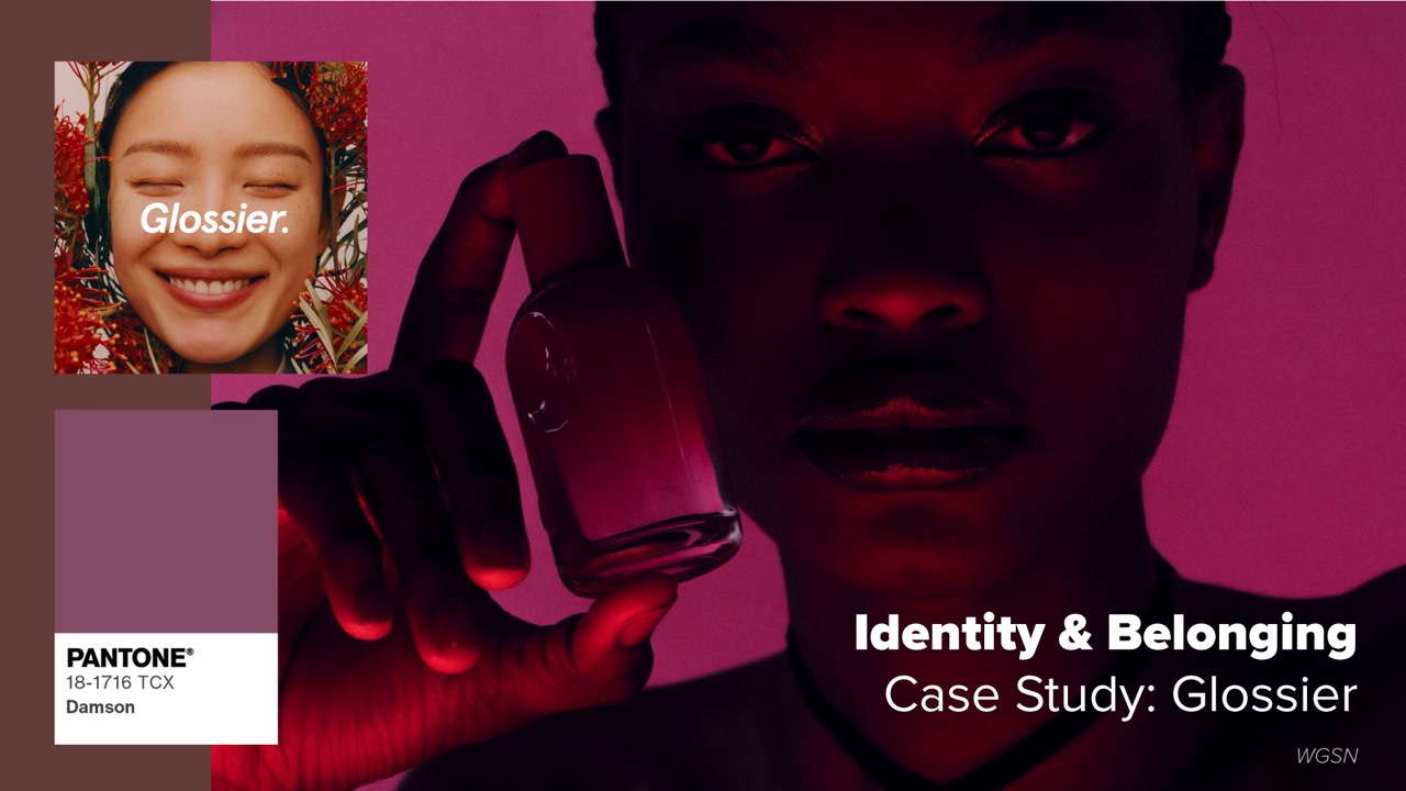
one industry analysis puts it: “Glossier’s real product was never makeup — it was belonging.”
The risk of getting this wrong is specific and costly. A wellness brand leaning into saturated brights sends a signal that contradicts its promise. A heritage brand chasing pastel trend cycles undermines the permanence it is selling. Color mismatch isn’t a taste problem, it’s a positioning problem, and consumers decode it in under a second, long before they read a word of copy.
There is an operational dimension too. Earthy, permanence-coded palettes imply products built to last, which in turn implies supply chain and material decisions that support resale and longevity. Expressive brights imply faster cycles and bolder retail environments. The palette is a commitment, not a coat of paint.
Looking Ahead
Two developments are worth watching closely.
Restoration and permanence may converge, easing anxiety through softness and solidity. Muted earth tones—dusty clay, moss, warm stone—may attract consumers seeking calm and durability. Natural dyes such as indigo, bark, and ecru, alongside hand-loomed textures, suggest this palette is emerging.
Maximalism’s staying power is uncertain. Though expressive individuality leads today, bold styles may tire audiences. Expression may shift from bright colors to subtler pairings, finishes, textures, and personalization. Brands that build expressive capabilities will be best prepared.
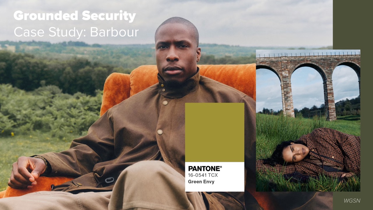
menswear as a mark of authenticity.
Worth monitoring: whether the emotional spender share among Gen Z holds as that cohort’s income grows, and whether secondhand growth continues pulling heritage palettes into the mainstream.
Bottom Line
For decades, retailers operated under the assumption that more choice meant more sales. Today, consumers are telling a different story. Faced with endless options both online and in-store, many shoppers are experiencing decision fatigue, making it harder to browse, compare, and ultimately make a purchase.
The emotional audit is not a recession behavior that will reverse when conditions improve. It reflects a more permanent shift in how people assess value, one where emotional function sits alongside price and quality as a purchase criterion rather than beneath them.
For brands, that raises the bar in a useful way. The question is no longer only what a product does, but what it does for the person buying it, and whether that answer is visible at a glance. Color is where that answer gets delivered first. Getting it right is not decoration. It is strategy made visible.
Interested in the full insights? Take me to the download